
Fashion color theory is more than a set of rules—it is your secret weapon to creating distinctive, memorable looks. Rethinking how you combine hues can elevate any outfit, making your clothing choices stand out in a sea of sameness.
But how do you master the art of color mixing? By understanding a few key principles and letting your creativity shine, every ensemble can become its own magnificent statement.
UNDERSTANDING COLOR THEORY BASICS
Color theory is a collection of guidelines that designers, artists, and stylists use to make visually appealing combinations. At its heart lies the color wheel, which organizes colors in a way that highlights their dynamic relationships:
- Primary Colors: Red, blue, and yellow—the origin of all other hues.
- Secondary Colors: Green, orange, and purple—formed by mixing two primary colors.
- Tertiary Colors: Created by blending a primary color with its neighboring secondary color.
Pay close attention to color harmonies. Complementary colors sit opposite each other on the wheel (like blue and orange), while analogous colors are side-by-side neighbors (such as green, blue-green, and blue). These harmonies form the basis for outfits that are inherently pleasing to the eye.

THE POWER OF UNDERTONES
Not all colors are created equal, even within the same family. Every shade brings its own unique undertone—either warm (red, orange, yellow) or cool (blue, green, purple). Recognizing undertones is a game-changer for fashion success, ensuring your clothing compliments your natural features perfectly.
- Warmer undertones shine beautifully in golds, earthy greens, warm browns, and rusts.
- Cooler undertones glow magnificently next to vivid jewel tones like sapphire, emerald, or icy blue.
- Neutral undertones enjoy the flexibility to wear almost any shade on the wheel.
BUILDING OUTFITS WITH COLOR SCHEMES
The possibilities come alive when you use classic color schemes as your daily styling guide:
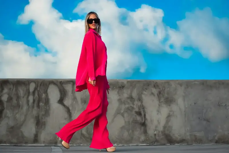
Monochromatic looks use variations of one single color to create cohesive, striking outfits. Picture layering various blues—a sky-blue shirt, navy pants, and powder-blue accessories—for an elegant feel with minimal fuss.
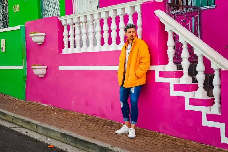
Complementary schemes offer maximum contrast and drama. Think forest green set against deep orange accents. These combinations ignite immediate visual interest and serve as fantastic style statements.
Analogous pairings whisper harmony, giving off a calm, effortless vibe. Wearing shades that live next to each other on the wheel—say, lilac, mauve, and blush—brings a subtle yet highly sophisticated effect.
Triadic schemes use three hues evenly spaced around the wheel, like red, yellow, and blue. This approach is playful, bold, and perfect for those ready to express an energetic personality.
STATEMENT COLORS AND THE RULE OF BALANCE
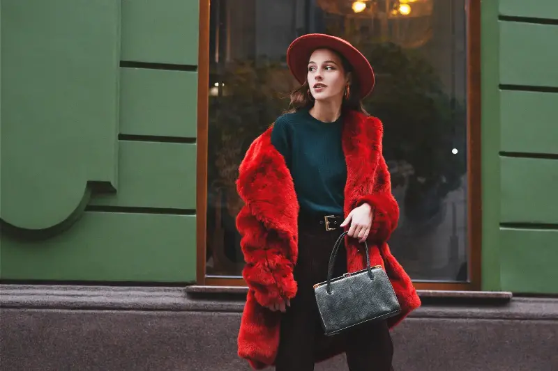
Vibrant colors are powerful style tools when used thoughtfully. A brilliant splash of crimson, lemon-yellow, or electric blue can define a look, but careful moderation ensures a chic result.
One great trick is to allow one statement color to take center stage while the rest of your outfit supports it with clean neutrals. Accessories are another subtle way to inject strong color. A pair of vibrant shoes, a bright turquoise handbag, or a colorful scarf can bring an entire outfit to life without overwhelming the eye.
Ultimately, style is about self-expression. When you make color choices with confidence, every outfit becomes a beautiful reflection of your personal story.